This post is part of the second annual C# advent. Two new posts are published every day between 1st December and 25th December.
In this post, I’m going to show you how to build toast notifications for your Blazor/Razor Components applications. By the time we’re done you’ll be able to show 4 different toasts depending on the level of importance (information, success, warning and error). The best bit, this will all be achieved without using a single line of JavaScript.
For those of you who are new to Blazor and want a bit more info first. You can checkout some of my other posts:
- What is Blazor and why is it so exciting?
- Introduction to server-side Blazor AKA Razor Components
- Blazor Bites series
All of the code in this post is available on my GitHub account.
Overview
Before we go any further I just want to give you a quick run down of the solution we will be building. We are going to create a component called Toast which will react to events invoked by a ToastService. The ToastService will be able to be injected into other components in the application. These components can then use it to issue toast messages. Make sense? I hope so, if not, it should all become clear shortly.
Prerequisites
For this post I’m going to be using JetBrains Rider, but you can use Visual Studio or Visual Studio Code instead. You will also need to have the lastest .NET SDK installed.
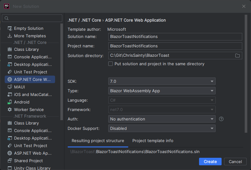
Creating a new project (optional)
I’m going to start start by creating a new stand-alone Blazor WebAssembly app. But feel free to use a different Blazor template or, if you wish, you can add the upcoming code to an existing project.
Building the Toast service
The first thing we need to do is create a new folder called Services and add a couple of bits. The first is an enum called ToastLevels, in here we need to add the 4 different types of toast as follows.
public enum ToastLevel
{
    Info,
    Success,
    Warning,
    Error
}
The second is a new class called ToastService with the following code.
public class ToastService : IDisposable
{
    public event Action<string, ToastLevel>? OnShow;
    public event Action? OnHide;
    private Timer? Countdown;

    public void ShowToast(string message, ToastLevel level)
    {
        OnShow?.Invoke(message, level);
        StartCountdown();
    }

    private void StartCountdown()
    {
        SetCountdown();

        if (Countdown!.Enabled)
        {
            Countdown.Stop();
            Countdown.Start();
        }
        else
        {
            Countdown!.Start();
        }
    }

    private void SetCountdown()
    {
        if (Countdown != null) return;

        Countdown = new Timer(5000);
        Countdown.Elapsed += HideToast;
        Countdown.AutoReset = false;
    }

    private void HideToast(object? source, ElapsedEventArgs args)
        => OnHide?.Invoke();

    public void Dispose()
        => Countdown?.Dispose();
}
The ToastService is going to be the glue that binds any component wanting to issue a toast, with the toast component which will actually display the toast. It has a single public method, ShowToast() which takes the string to be shown in the toast and the level of the toast.
The service also has two events, OnShow and OnHide, and a timer, Countdown. Our toast component will subscribe to the events and use them to show and hide itself. The timer is used internally by the service and is set at 5 seconds. When it elapses it invokes the OnHide event.
Building the Toast component
With the toast service sorted we now need to build the toast component. This will work with the service to get toasts on the screen.
Let’s start by creating a new component in the Shared folder called Toast.razor. At the top of the component, we’re going to inject the ToastService and make the component implement IDisposable.
@inject ToastService ToastService
@implements IDisposable
Then in the code block add the following logic.
@code {
    private string? _heading;
    private string? _message;
    private bool _isVisible;
    private string? _backgroundCssClass;
    private string? _iconCssClass;

    protected override void OnInitialized()
    {
        ToastService.OnShow += ShowToast;
        ToastService.OnHide += HideToast;
    }

    private void ShowToast(string message, ToastLevel level)
    {
        BuildToastSettings(level, message);
        _isVisible = true;
        StateHasChanged();
    }

    private void HideToast()
    {
        _isVisible = false;
        StateHasChanged();
    }

    private void BuildToastSettings(ToastLevel level, string message)
    {
        switch (level)
        {
            case ToastLevel.Info:
                _backgroundCssClass = $"bg-info";
                _iconCssClass = "info";
                _heading = "Info";
                break;
            case ToastLevel.Success:
                _backgroundCssClass = $"bg-success";
                _iconCssClass = "check";
                _heading = "Success";
                break;
            case ToastLevel.Warning:
                _backgroundCssClass = $"bg-warning";
                _iconCssClass = "exclamation";
                _heading = "Warning";
                break;
            case ToastLevel.Error:
                _backgroundCssClass = "bg-danger";
                _iconCssClass = "times";
                _heading = "Error";
                break;
            default:
                throw new ArgumentOutOfRangeException(nameof(level), level, null);
        }

        _message = message;
    }

    void IDisposable.Dispose()
    {
        ToastService.OnShow -= ShowToast;
        ToastService.OnHide -= HideToast;
    }
}
Hopefully the above makes sense but let’s walk through it just to be sure.
To start, we’re defining a few fields that will be used in the markup portion of the component.
Next, we’re overriding one of Blazors component lifecycle events, OnInitialized (you can read about Blazors other lifecycle events in this post). In here, we’re wiring up the events we defined in the ToastService to handlers in the component.
Then we have the event handlers, ShowToast and HideToast. ShowToast takes the message and the toast level and passes them to BuildToastSettings. This then sets various CSS class names, the heading and message. The IsVisible property is then set on the component and StateHasChanged is called. HideToast just sets IsVisible to false and calls StateHasChanged.
Quick note on StateHasChanged
You may be wondering what StateHasChanged is and why are we calling it? Let me explain.
A component usually needs to re-render when its state changes, a property value updates for example. When this update comes from within the component itself or via a value passed into the component using the [Parameter] directive, i.e. something the component knows about and can monitor. Then a re-render is triggered automatically.
However, if an update happens to the components state which is from an external source, for example an event. Then this automatic process is bypassed and a manual call has to be made to let the component know something has changed. This is where StateHasChanged comes in.
In our case we’re updating the components values based on an external event, OnShow from the ToastService. This means we have to call StateHasChanged to let the component know it needs to re-render.
Now we have the component’s logic in place let’s move onto the markup.
<div class="cs-toast @(_isVisible ? "cs-toast-visible" : null) @_backgroundCssClass">
    <div class="cs-toast-icon">
        <i class="fa fa-@_iconCssClass" aria-hidden="true"></i>
    </div>
    <div class="cs-toast-body">
        <h5>@_heading</h5>
        <p>@_message</p>
    </div>
</div>
The markup defines a div that has a bit of logic on it to toggle the cs-toast-visible class based on the _isVisible field. We then have a div for the icon and a div for the body of the toast.
We also need some styling to go with our markup.
.cs-toast {
    display: none;
    padding: 1.5rem;
    color: #fff;
    z-index: 999;
    position: absolute;
    width: 25rem;
    top: 2rem;
    border-radius: 1rem;
    right: 2rem;
}

.cs-toast-icon {
    display: flex;
    flex-direction: column;
    justify-content: center;
    padding: 0 1rem;
    font-size: 2.5rem;
}

.cs-toast-body {
    display: flex;
    flex-direction: column;
    flex: 1;
    padding-left: 1rem;
}

.cs-toast-body p {
    margin-bottom: 0;
}

.cs-toast-visible {
    display: flex;
    flex-direction: row;
    animation: fadein 1.5s;
}

@keyframes fadein {
    from {
        opacity: 0;
    }

    to {
        opacity: 1;
    }
}
Putting everything together
We almost have a working toast component, we just need to wire up a couple of things then we should be able to give it a test.
Registering with DI
We need to register our ToastService with Blazors DI container. This is done in Program.cs in the same way you would with any ASP.NET Core application.
builder.Services.AddScoped<ToastService>();
We’re registering the service as scoped, the reason for this is that it will give the correct behaviour in both Blazor WebAssembly and Blazor Server.
If you’re interested in how the various service lifetimes work in Blazor WebAssembly and Blazor Server applications checkout my imaginatively named post, Service lifetimes in Blazor.
Adding the Toast component to the main layout
We also need to add the Toast component into our MainLayout component as follows.
@inherits LayoutComponentBase

<Toast />

<div class="page">
    <div class="sidebar">
        <NavMenu/>
    </div>

    <main>
        <div class="top-row px-4">
            <a href="https://docs.microsoft.com/aspnet/" target="_blank">About</a>
        </div>

        <article class="content px-4">
            @Body
        </article>
    </main>
</div>
As well as a link to FontAwesome in the head tag of Index.html.
<head>
    ...
    <link rel="stylesheet" href="https://use.fontawesome.com/releases/v5.6.1/css/all.css" integrity="sha384-gfdkjb5BdAXd+lj+gudLWI+BXq4IuLW5IT+brZEZsLFm++aCMlF1V92rMkPaX4PP" crossorigin="anonymous">
    ...
</head>
So we don’t have to use full qualified named in our components when injecting the ToastService we can add a using statement to the _Imports.razor in the root of the application.
@using BlazorToastNotifications.Services
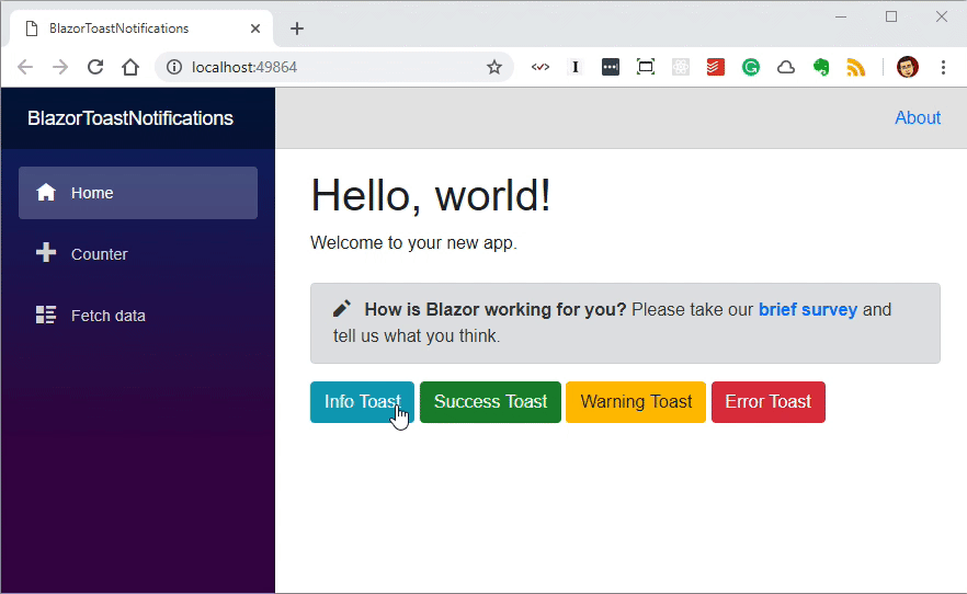
Add toast calls to the index page
The last thing to do is to modify the Index component so we can show off our new toasts.
@page "/"
@inject ToastService toastService

<PageTitle>Index</PageTitle>

<h1>Hello, world!</h1>

Welcome to your new app.

<SurveyPrompt Title="How is Blazor working for you?" />

<button class="btn btn-info" @onclick="@(() => toastService.ShowToast("I'm an INFO message", ToastLevel.Info))">Info Toast</button>
<button class="btn btn-success" @onclick="@(() => toastService.ShowToast("I'm a SUCCESS message", ToastLevel.Success))">Success Toast</button>
<button class="btn btn-warning" @onclick="@(() => toastService.ShowToast("I'm a WARNING message", ToastLevel.Warning))">Warning Toast</button>
<button class="btn btn-danger" @onclick="@(() => toastService.ShowToast("I'm an ERROR message", ToastLevel.Error))">Error Toast</button>
The finished result!
With all that in place we should now be able to spin up our app and click each of the buttons and see the 4 different toast messages.
Summary
I hope you have enjoyed reading this post and if you’re new to Blazor I hope I’ve piqued your interest and inspired you to find out more. Here are a few links that are worth checking out.
I think it’s really exciting to see how much is already achievable in Blazor. Being able to create notifications like this using just HTML, CSS and C# without having to write a single line of JavaScript is just fantastic. And things are only going to get better as WebAssembly and .NET Core runtimes continue to develop.
All the code for this post can be found on GitHub. I will also be packing this all up into a Nuget package in the next couple of days so you can just install it into your Blazor projects.